Outline
Bright is a fintech software company, with a suite of products covering practice management, tax compliance, bookkeeping, accounts production, payroll and company secretarial.
Problem
Bright's customers managing multiple product subscriptions had no single place to view, manage, or update their account billing details, subscription plans, user seats, and invoices were all siloed by product. This created friction for customers and operational overhead for the teams supporting them.
Who is affected:
- Customers on multiple Bright products, who had to manage separate accounts for each product, with no consolidated view of what they were paying, when renewals were due, or how many seats they had allocated.
- Support had to log in to multiple systems to answer a single account query, slowing resolution time and increasing the risk of inconsistent information.
- Finance had no consolidated view of customer billing status across the portfolio, making reconciliation and reporting unnecessarily complex.
Core building blocks
The core building blocks of BrightHub are the subscription components, the elements a customer interacts with to build and manage their subscription. Rather than designing these from scratch, I mapped each one 1:1 to a billing model type returned by Maxio's pricing API. That constraint shaped the whole section: every pattern needed to represent a specific Maxio billing model exactly, while still reading as an ordinary, understandable UI control to a non-technical customer.
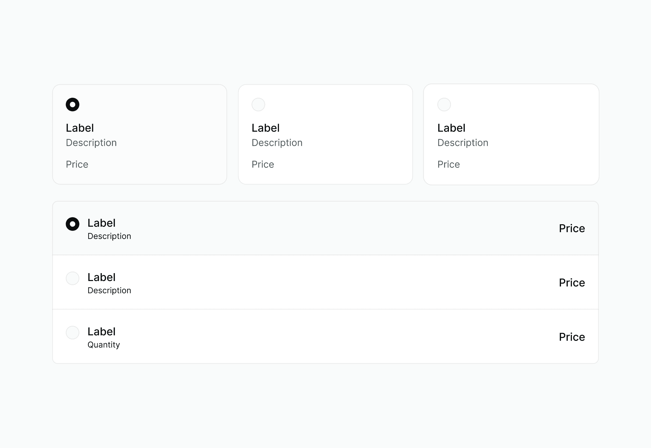
Single selection
Used where a customer must choose exactly one option, such as a plan tier, the design needed to make it clear that picking a new option replaces the current one, not adds to it.
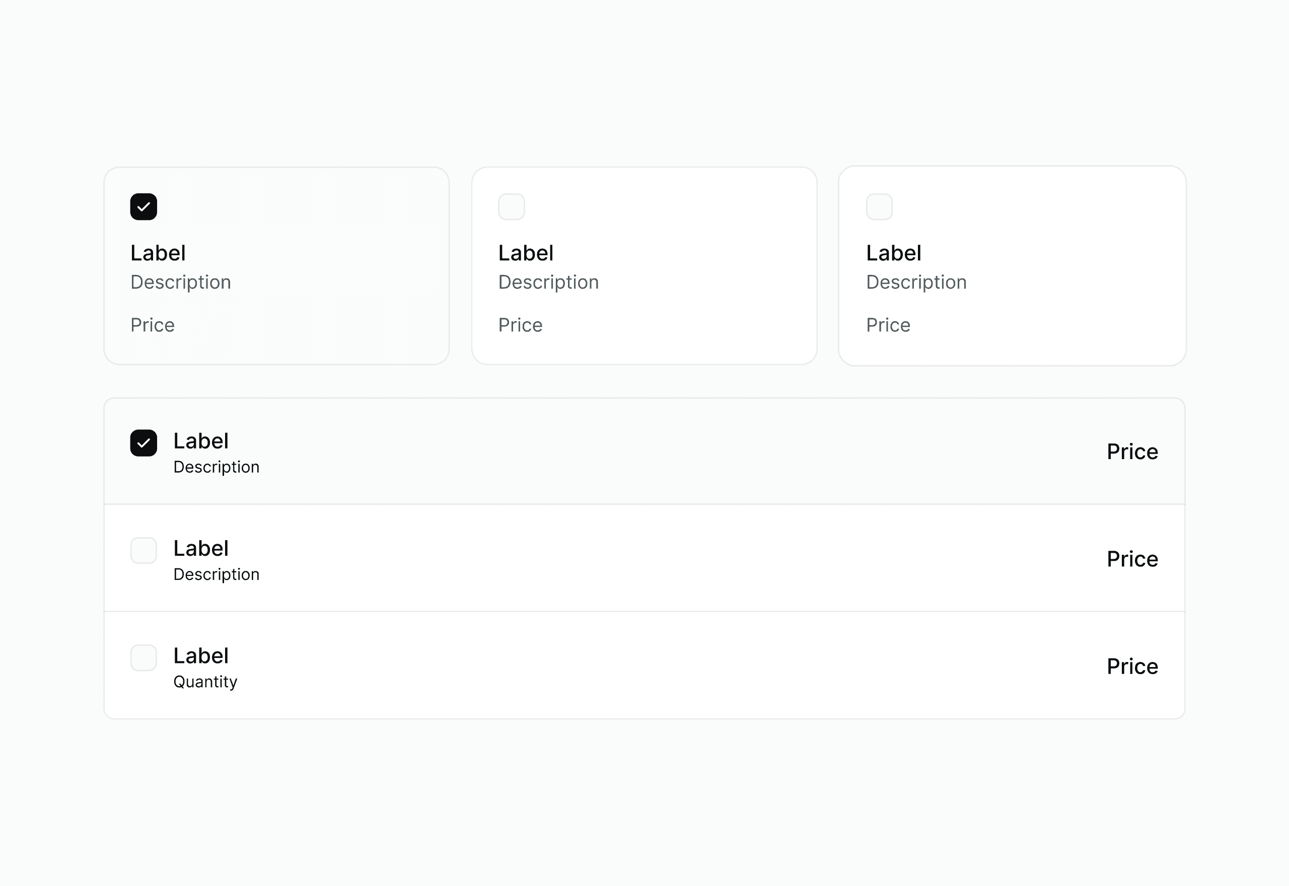
Multiple selection
Used for optional add-ons a customer can combine freely, the pattern needed to keep each item's individual cost visible even as several were selected together.
Volume selection
Used where the per-unit price changes based on total quantity purchased, the design surfaces which pricing tier a customer is currently in, so the cost per unit doesn't feel arbitrary.
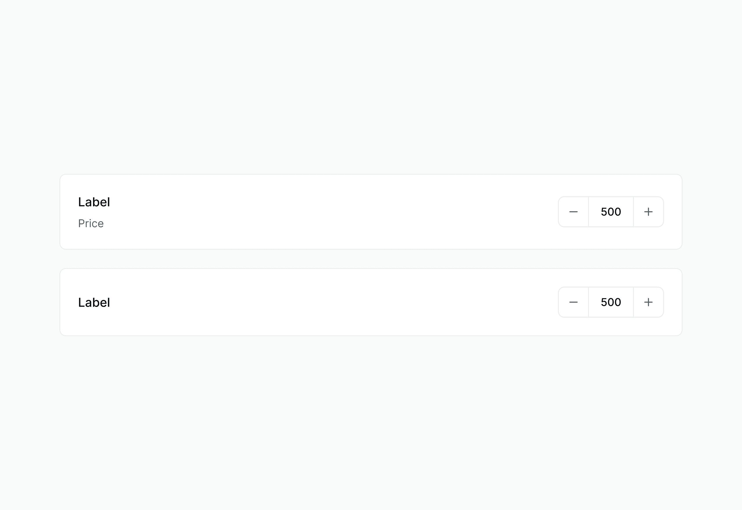
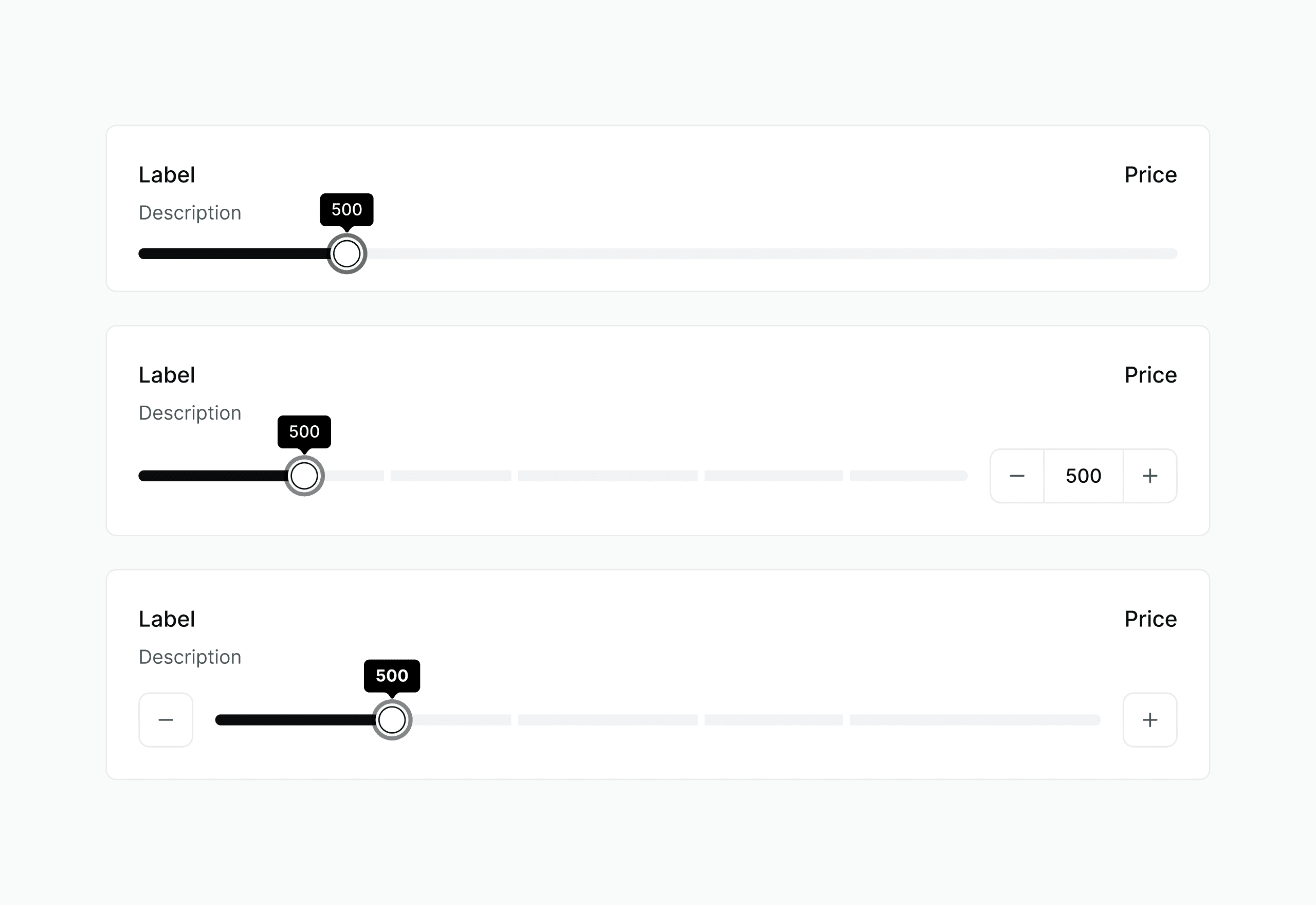
Quantity / Stairstep
Used where cost jumps at fixed quantity thresholds rather than scaling per unit, the design needed to make the next threshold visible before a customer crossed it unexpectedly.
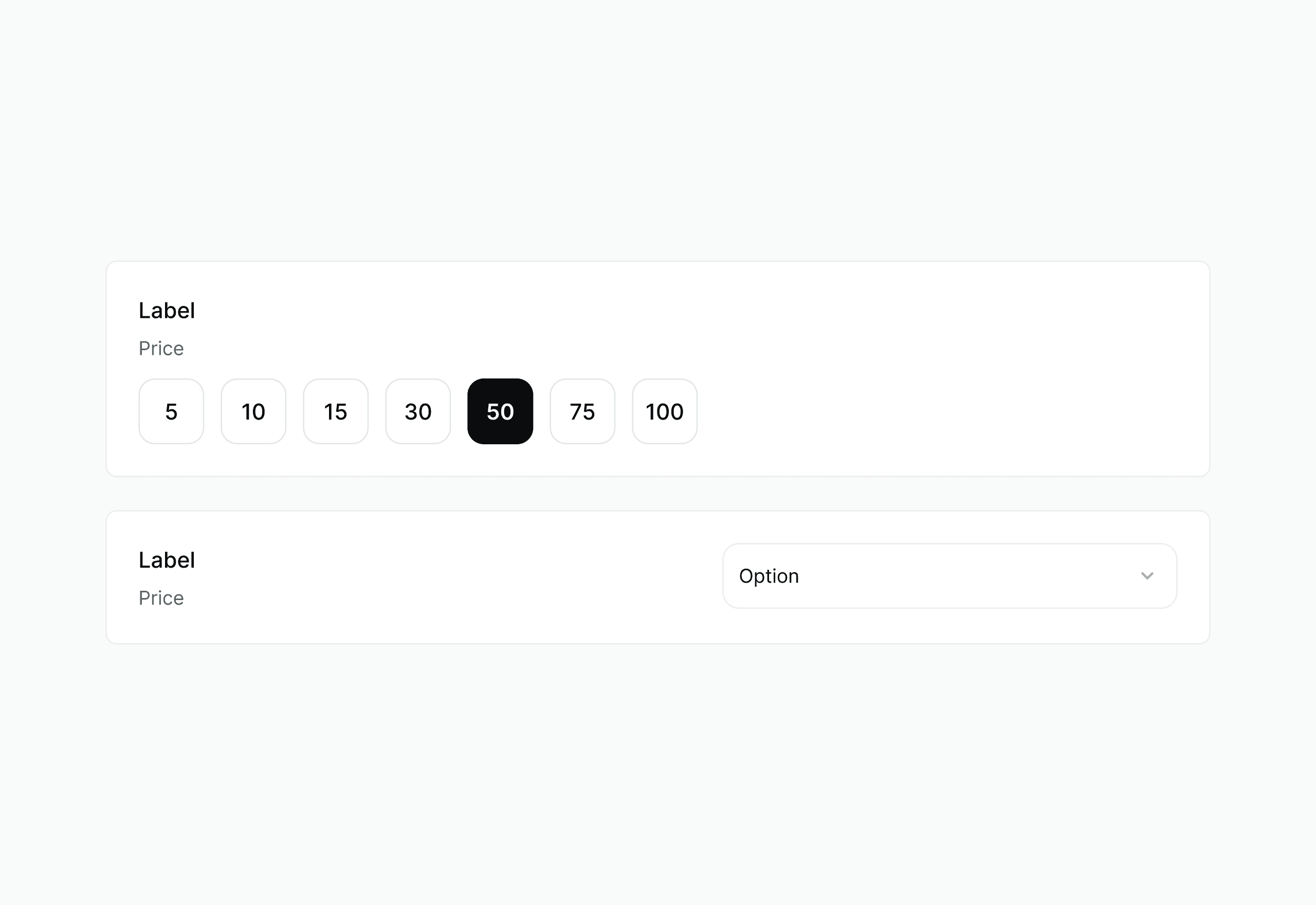
Fixed quantity
Used where an add-on is available in a set, non-adjustable amount, deliberately simpler, with no quantity control, so it doesn't imply flexibility that isn't there.
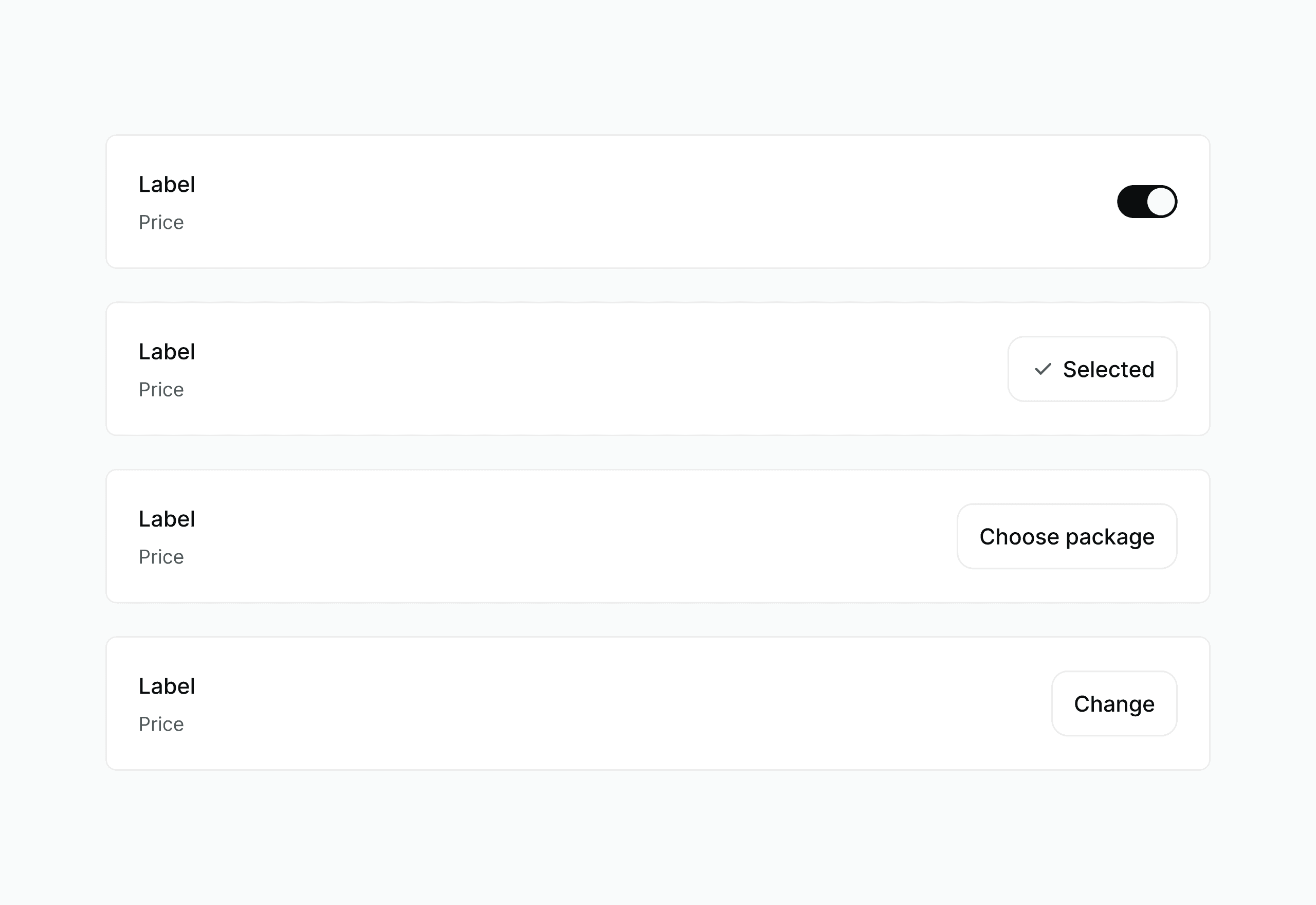
Boolean
Used for simple on/off add-ons, a toggle rather than a selection list, since there was only ever one decision to make.
Designs
Now let's bring everything together into one unified experience.
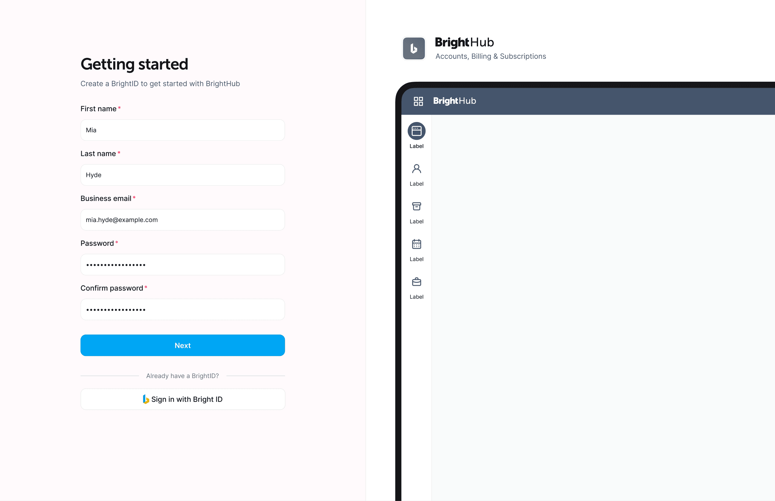
Creating a BrightHub account
Before a user can use BrightHub, they need to create a BrightHub account.
Product dashboard
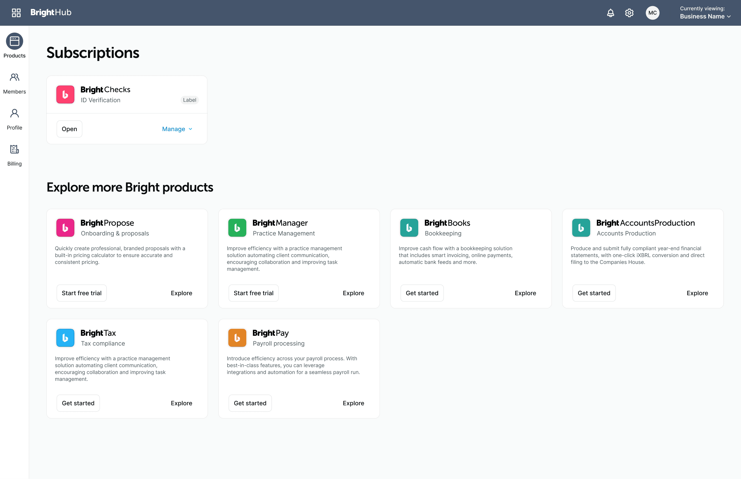
The dashboard provides a centralised entry point for all BrightHub activity: active subscriptions, upcoming renewals, outstanding invoices, and quick links into each Bright product. The design prioritises status at a glance, a customer should be able to understand the health of their account without drilling into any individual section.
Product cards
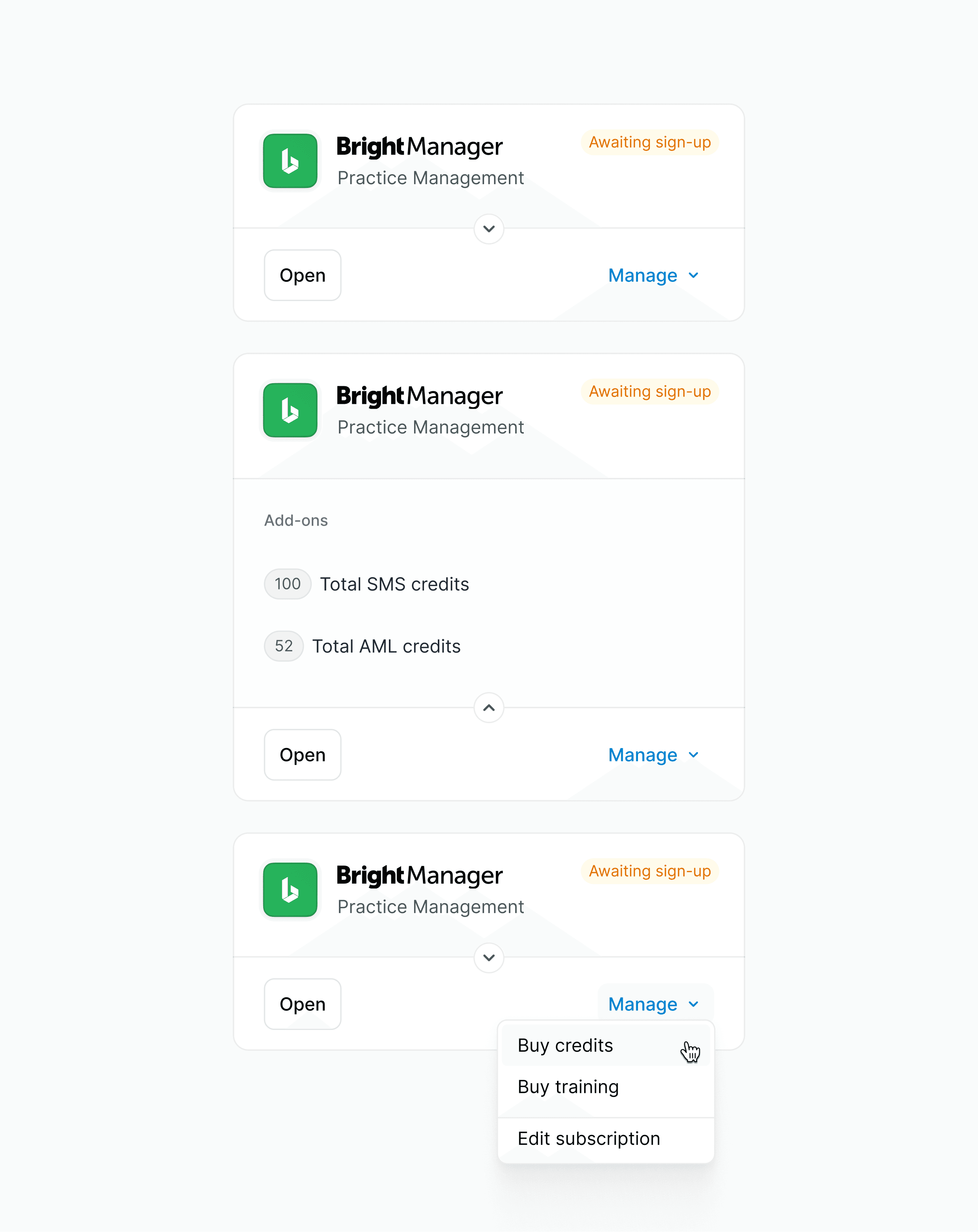
Product cards needed to give the customer a snapshot of their subscription at a glance. A technical limitation in Maxio meant add-ons couldn't be purchased during the 'build your subscription' flow, so I added a dropdown to the card itself, giving customers a way to buy additional add-ons without needing to enter that flow.
Building a subscription
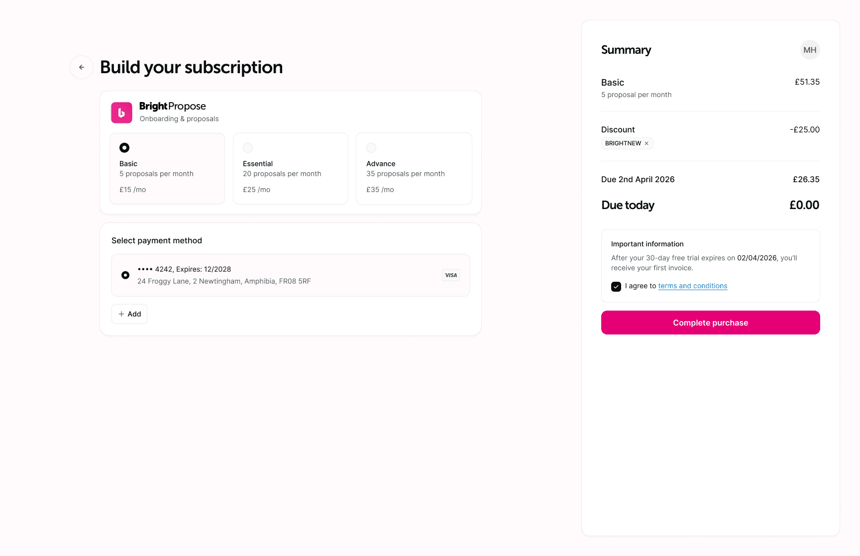
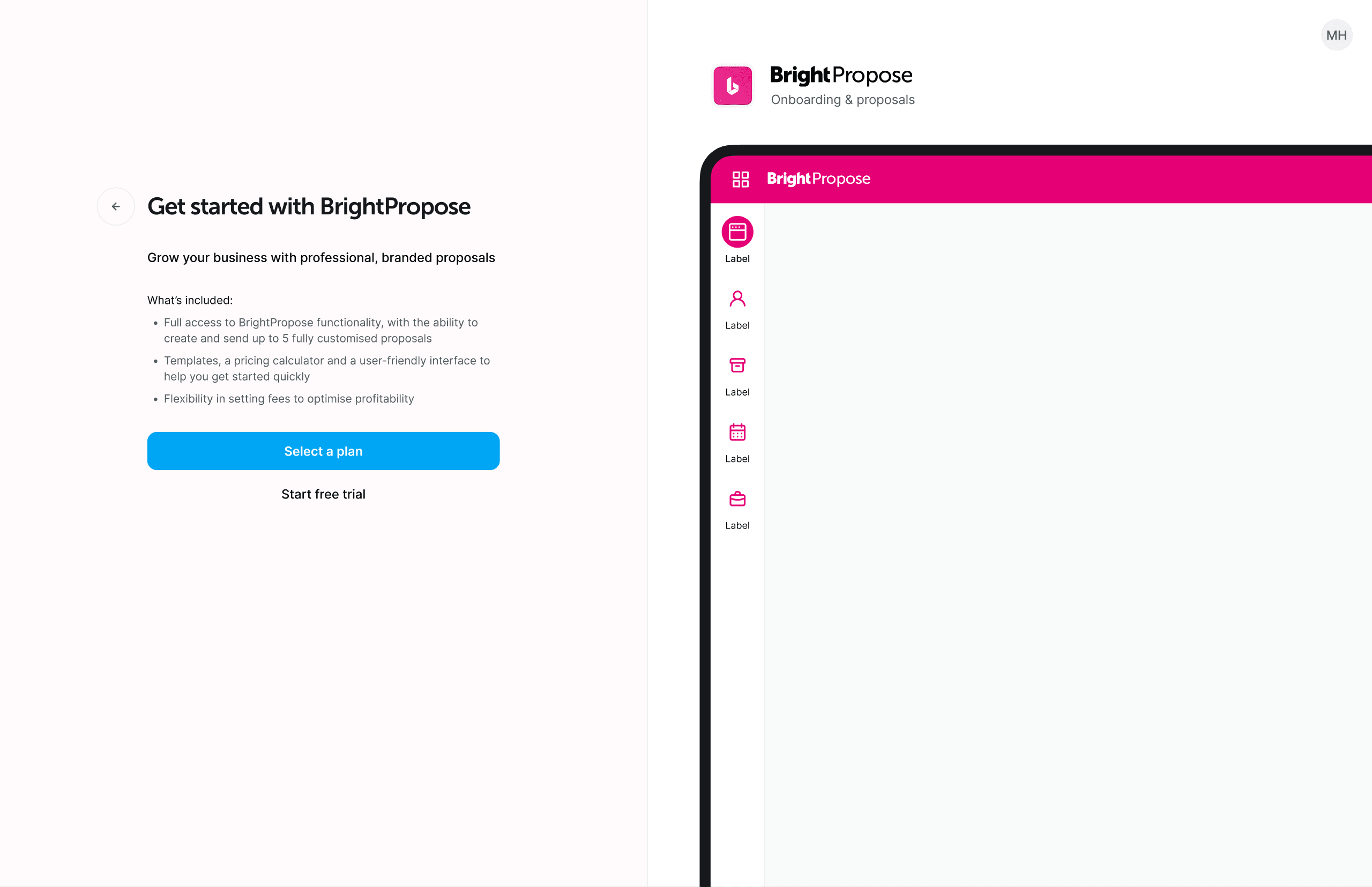
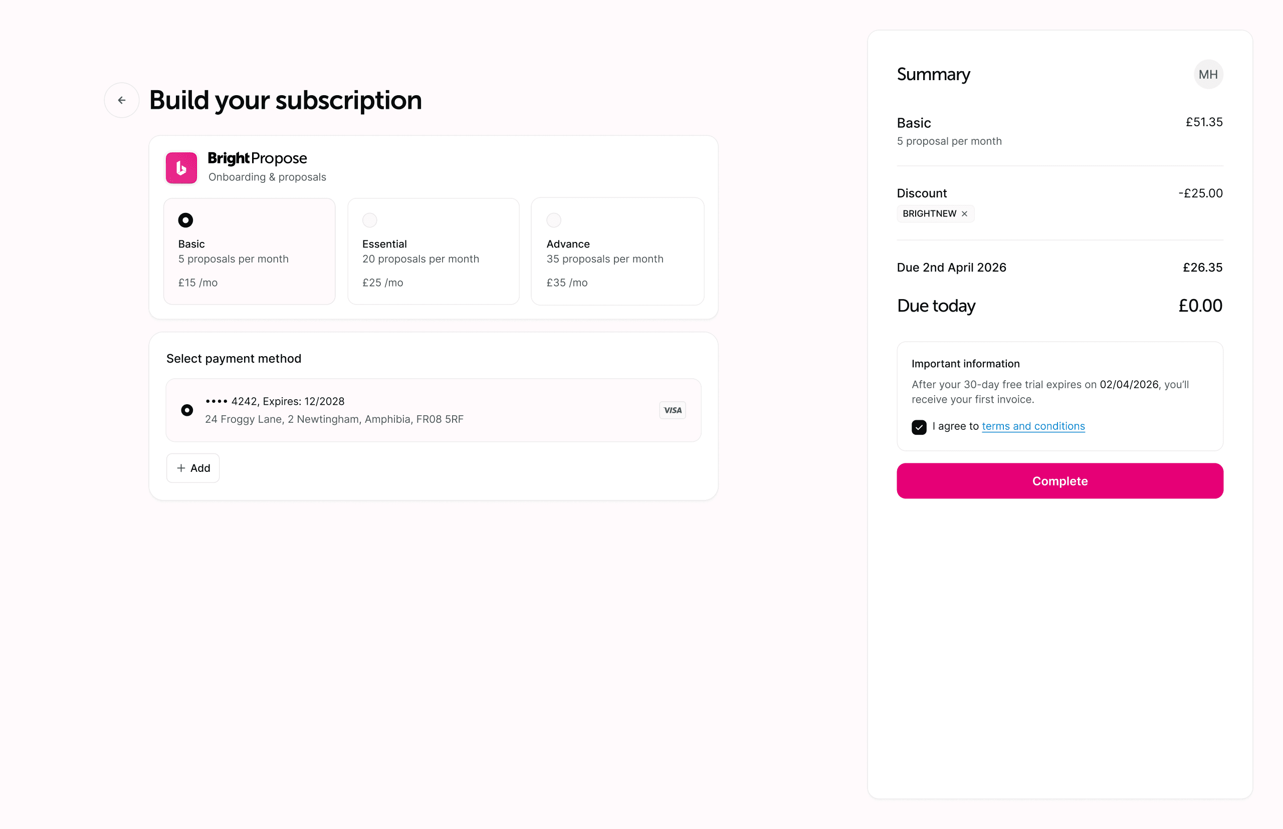
Subscription management covers the full lifecycle of a plan from initial purchase through upgrades, downgrades, and cancellation. The key design challenge was mapping Maxio's billing model types into patterns that made sense to non-technical customers, without exposing the underlying complexity or requiring them to understand what kind of pricing model they were on.
Plan change flows surface the relevant information at the point of decision, what will change, what the new cost will be, when the change takes effect, without requiring customers to understand system logic or billing cycle mechanics.
Managing users
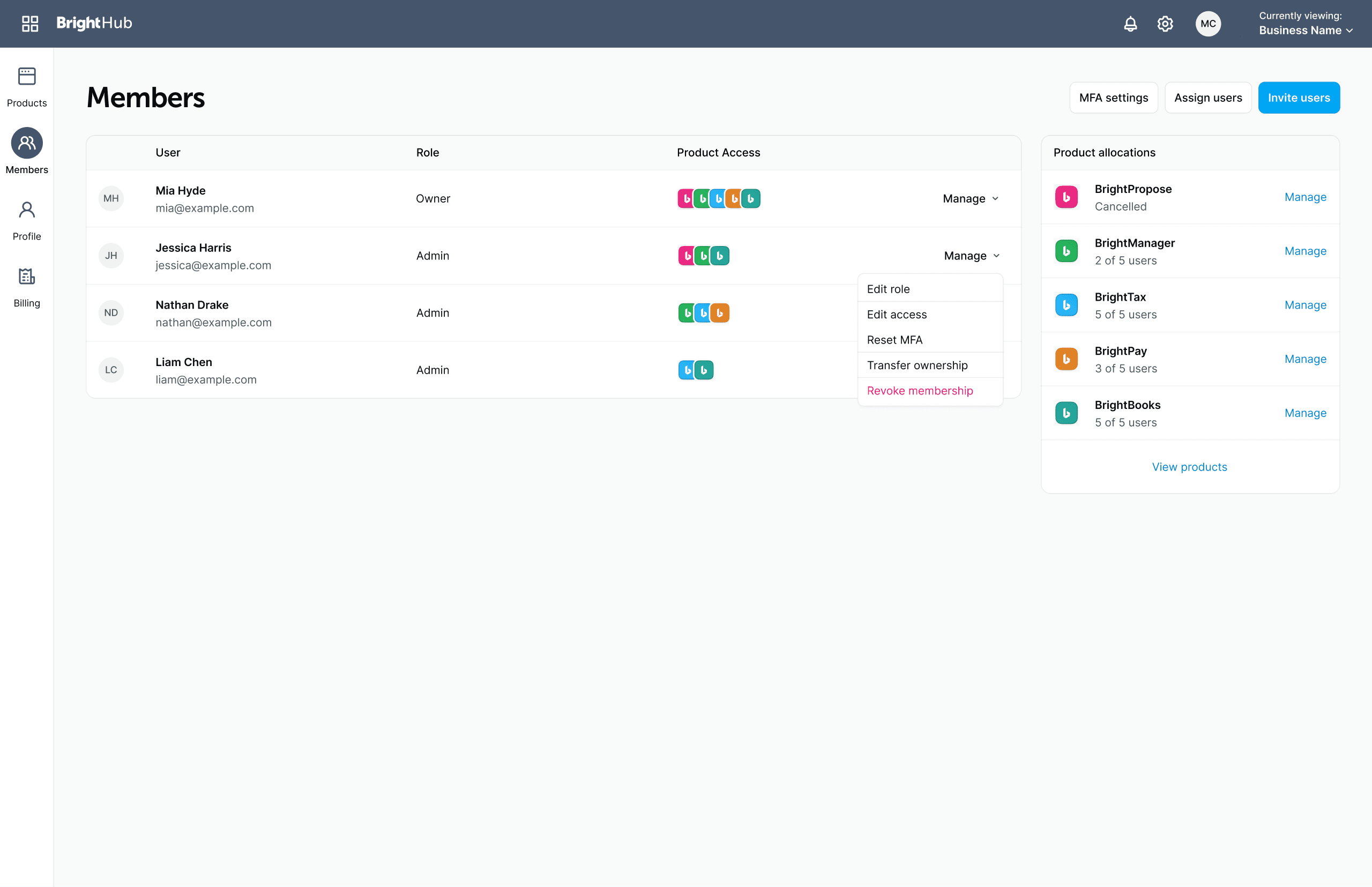
User management gives admins a single place to invite, remove, and allocate seats across every Bright product a customer subscribes to, rather than managing users separately within each one.
The key design challenge was scoping, an admin needed to see at a glance which product each seat belonged to and adjust access without accidentally granting it somewhere it wasn't intended.
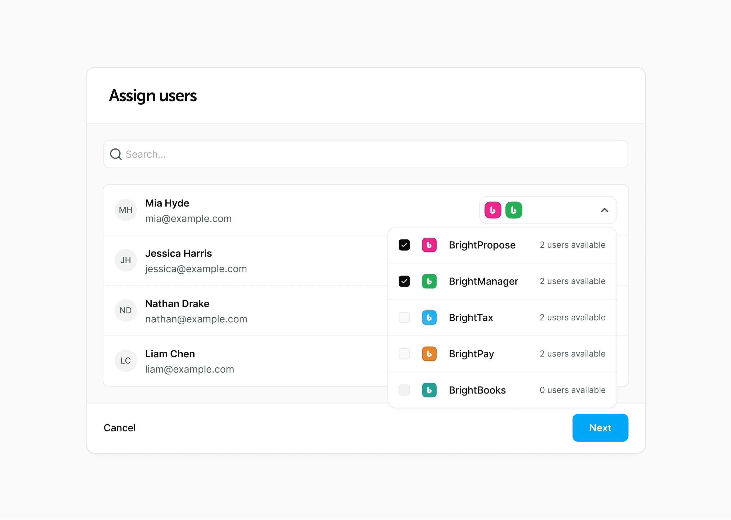
Admins also needed a simple way to assign users to a given product. The assign user modal below gives them an overview of all their products alongside the remaining user allocations for each.
Payments and invoicing
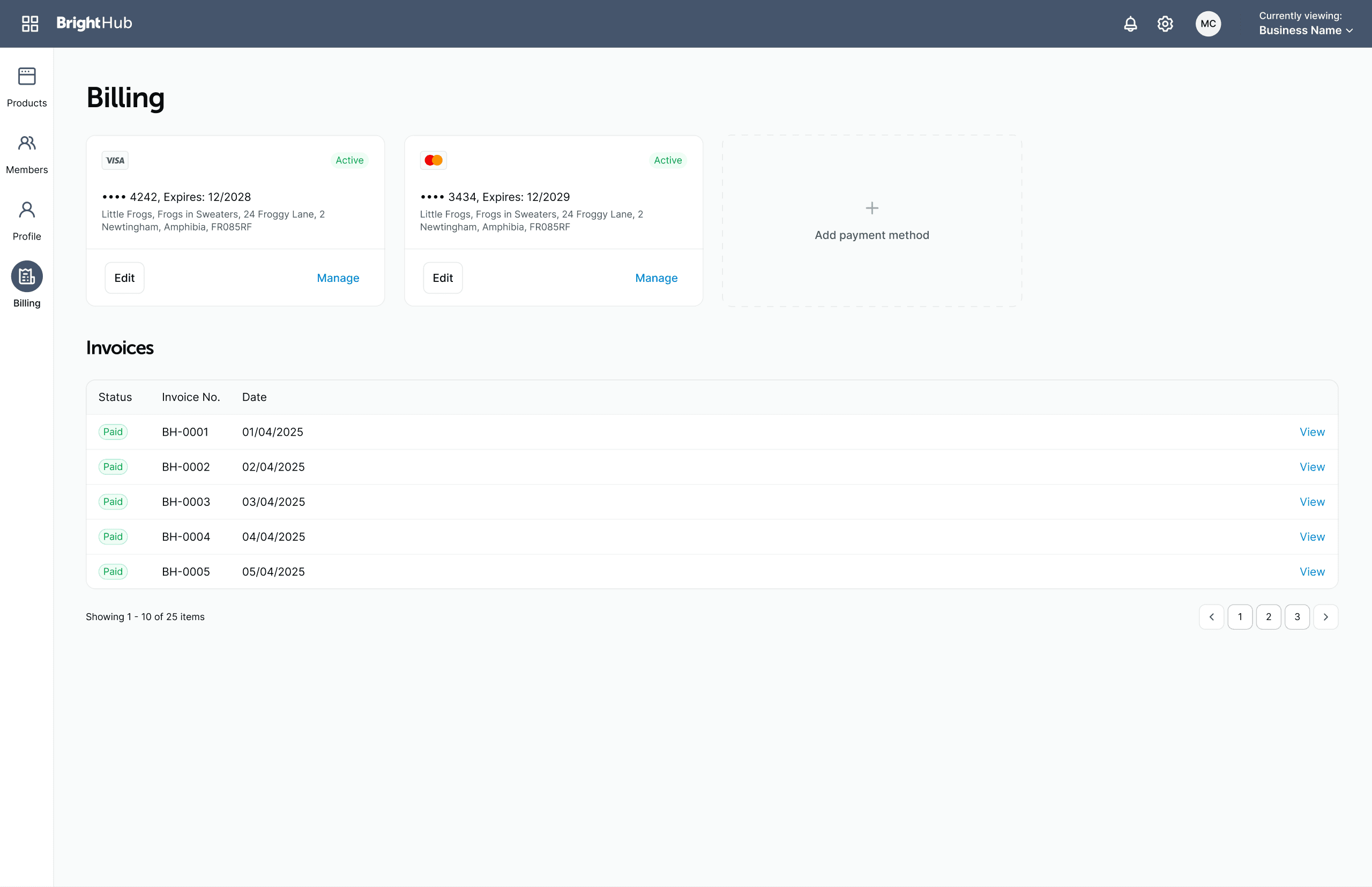
Billing brings a customer's payment methods and invoice history into one place, rather than against each product. Cards are shown with their status, expiry, and billing address at a glance, so a customer can confirm which method is active and edit or manage it directly, or add a new one, without contacting support.
Below that, the invoice list gives finance and admin users a full paper trail across the account: status, invoice number, and date for every charge, with each one viewable individually. The key design challenge was surfacing status clearly enough that an admin could spot an overdue or failed payment without opening every invoice, which is what drove the prominent status pill at the start of each row.
Design validation
Validation was primarily conducted through internal review with the support and finance teams, the users with the clearest picture of where the existing per-product experience fell short and what information they needed to do their jobs.
Key adjustments from that feedback:
- Invoice and billing history needed more prominence on the dashboard than initial designs gave it, finance users wanted this accessible without navigating into a product-specific section
- Plan change confirmation needed clearer effective date information, early iterations didn't make it immediately obvious when a change would take effect relative to the current billing cycle
- User allocation across multiple products required clearer scoping, it wasn't immediately obvious in early designs which seats belonged to which product
Outcomes & Impact
BrightHub launched as the unified account layer across Bright's product suite, replacing the fragmented per-product approach with a single authenticated experience.
Key outcomes:
- Customers could manage subscriptions, billing, and users for all Bright products from a single interface
- Support team overhead reduced, fewer account-related queries requiring manual intervention across multiple systems
- Finance team gained a consolidated view of customer billing status across the product portfolio
- Subscription self-service reduced dependency on the sales team for common plan changes, including seat adjustments and plan upgrades
Hard metrics weren't available at the time of building BrightHub, it was a consolidation play with no direct predecessor to benchmark against. The meaningful signals were operational: support query volume for accounts and the proportion of common plan changes handled without sales or support involvement.
Reflection
The components and flows were built as a direct, 1:1 mapping to Maxio's pricing API rather than from user research, BrightHub was a product-led initiative, and the priority was shipping a unified account layer against a defined technical scope. Validation happened through internal review with support and finance after the fact, which caught real gaps, invoice prominence, effective-date clarity, seat scoping, but it was validation, not discovery.
In hindsight, involving customers earlier, even lightweight testing of the component patterns before they were built out across all six billing models, would have surfaced some of those same issues sooner and cheaper than the internal review pass did. Product-led doesn't have to mean research-last; that's the main thing I'd change if I ran this project again.